A VR Glimpse into the Future of Mobility
Posted; April 27, 2020
What happens when the driver’s experience disappears and we all become passengers? Ultraleap’s new automotive showcase uses mid-air haptics and hand tracking in a VR environment to offer a glimpse into the interactive cabins of the future. Charlie Alexander, Director of Automotive Products, goes through some of the core interactive mechanics and challenges.
With the advent of self-driving cars, humanity is on the verge of reclaiming trillions of lost hours. Vehicles will become not just a tool for getting from A to B, but a new kind of place to get things done.
The passenger of the future might well be wearing AR glasses (or possibly even a VR headset). The challenge, however, is that they also need to be able to interact with virtual content when in transit.
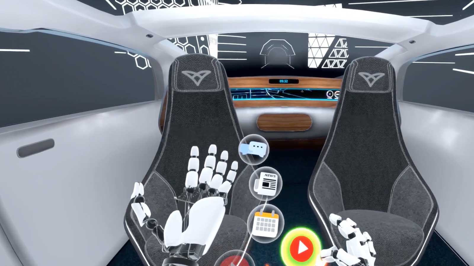
While hand-held controllers work well for home gaming, they’re much less practical when you’re on the move, using shared devices, or have limited time to learn controls. As part of exploring this future, we developed an interactive automotive showcase, revealed at CES 2020. Powered by hand tracking and mid-air haptics, it uses VR to explore what a cabin where you can interact with virtual content using only natural gestures might be like.
We looked at how people use their hands to interact with physical objects in everyday life, and applied these insights to the development of an intuitive, 3D user interface. Designed to be a thought-starter, our VR experience explores productivity, entertainment, social interaction, and relaxation in the autonomous cabins of the future.
Pinch as a Core Interaction
When exposed to any new interface, people need to start by building a new intuition about how things work. Once a basic interactive vocabulary is established, higher-level interactions become possible.
Our challenge was to make our 3D interface feel compelling and aspirational, while also making it possible for users to learn and complete the VR experience in a few minutes. With that in mind, we focused on a single core interaction: the pinch.
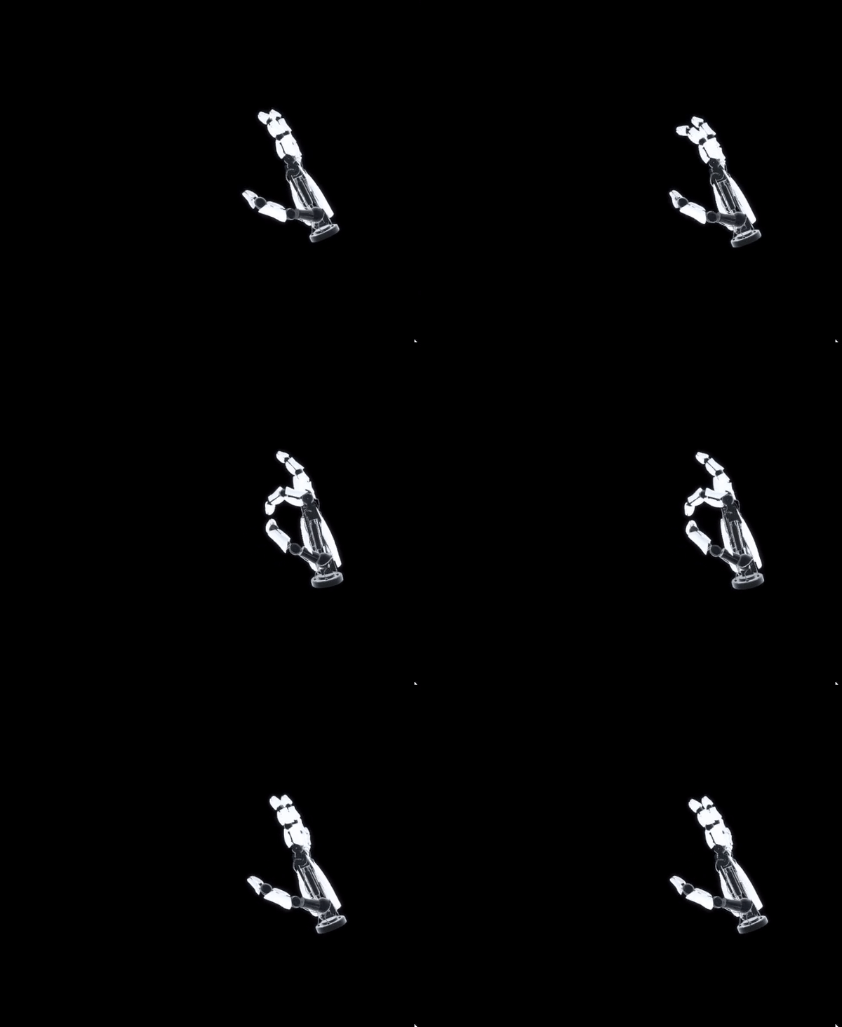
Pinching is well-suited for physical controls when selecting, stretching or pulling small targets (such as a small object or an interactive anchor on a larger object). It offers enough dexterity for small movements to be precise and expressive while staying energy-efficient over longer periods of time.
However, not all pinches are equal – we found that different people had very different ideas of what a pinch might be. With this in mind, we ended up allowing users to grab/pinch using any combination of fingers, so long as it included their index finger. We also included an outline of the ideal pinch gesture at the start of the demo. This meant users had to perform it at least once to begin the experience
Natural, intuitive interface design
The core interaction design of our VR passenger experience is about reacting to intuitive gestures. Pinch allows for simple and direct interactions with virtual objects. Throughout the course of the demo, users can feel the interfaces as their hand's phase through them. Interactions are reinforced through the targeted use of our ultrasonic haptic technology.
The VR experience is based around two fundamental interfaces: orbs and panels.
Orbs
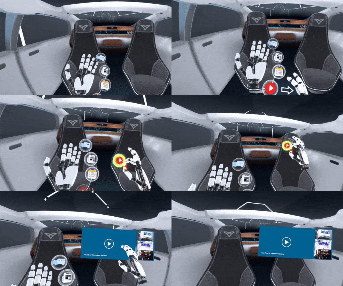
Orbs are pinchable elements used in two distinct interfaces: hand menus and sliders. There are several sliders throughout, including one that the user needs to slide before the experience fully begins. This shows the user that orbs are objects they can manipulate to make decisions.
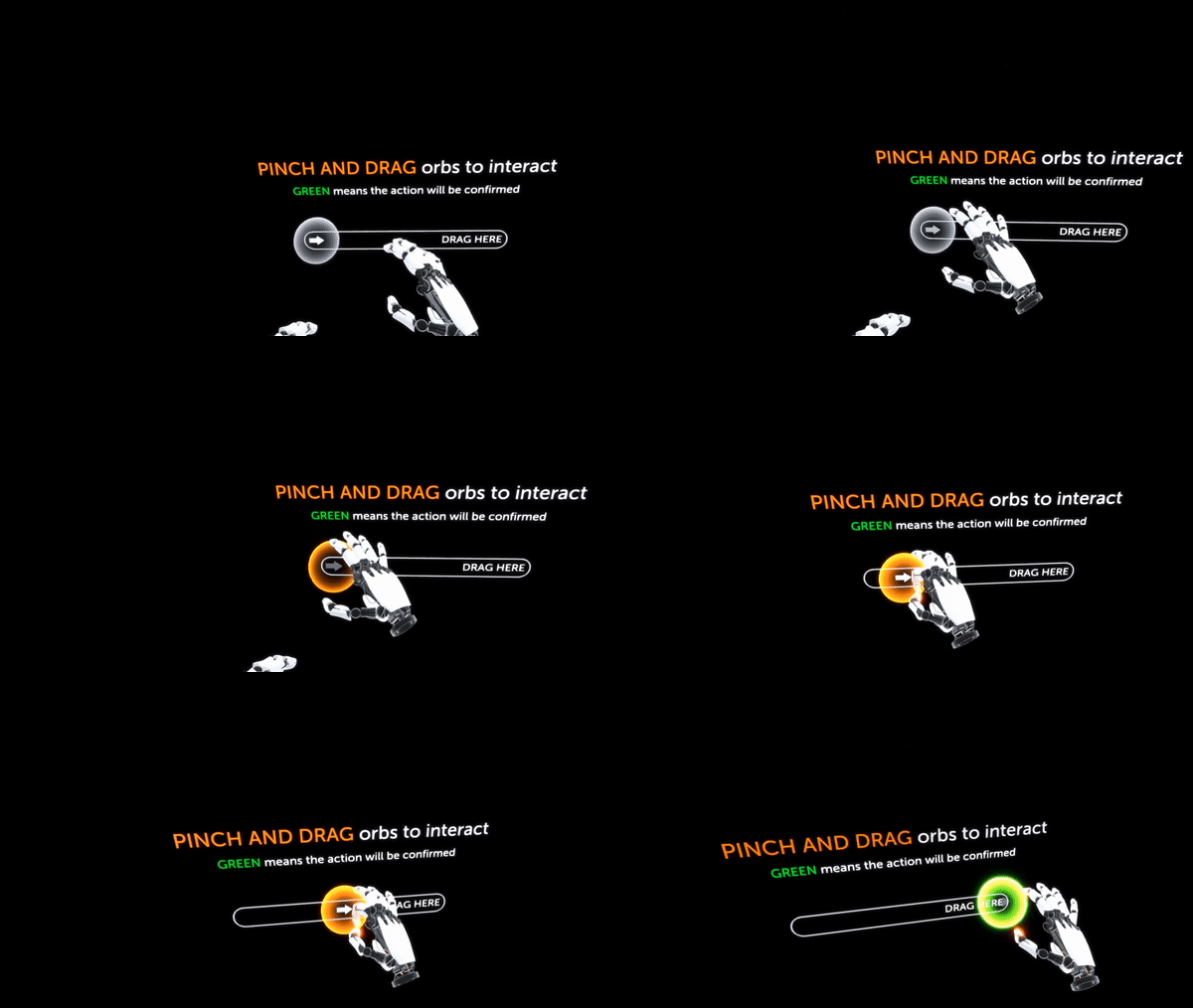
The orbs in the first two sliders contain arrow icons to reinforce the pinch-and-slide interaction. Later sliders are empty. Since the user now knows how the sliders work, arrows would just clutter the interface.
The other core interface is the hand menu. It features four orbs, each with its own unique icon. The hand menu only appears when one of your palms is facing upwards. This ensures the icons don’t clutter the scene unnecessarily.
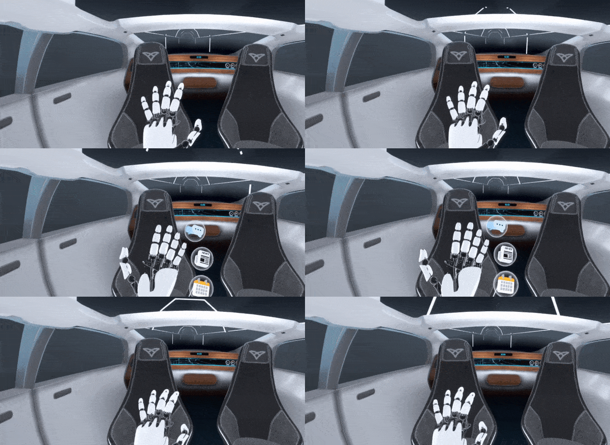
When a hand menu orb is pinched and placed into the environment, it spawns a content panel.
Panels
While virtual reality is a 3D medium, many kinds of content are still best-suited to 2D displays. In our VR experience, floating 2D panels allow for direct physical interaction:
- Single pinch to move the panel around in space. This makes it easy to organize a virtual workspace and make room for additional panels.
- Two-handed pinch to scale the panel. We encourage the user to target the borders of the panel, using orange circles and arrows that appear along the corners when both hands are near the panel. (However, it’s flexible enough to work even if you pinch the middle of the panel.)
In the productivity section of our VR experience, you can easily navigate and explore four different types of content via floating panels.
Each content panel has its own interaction associated with a finger or hand “touching” the panel. Whenever this happens, the point of intersection on the hand glows orange, and haptic feedback is applied.
- News offers a simple scrolling interface, which responds to one or more fingers.
- Social feed allows you to scroll and “like” posts by tapping them. (We deployed haptics to the index finger or the entire hand depending on whether a content panel was in select or scroll mode.)
- Calendar has two different interactive zones: one for tapping and one for scrolling. In this case, you can tap to select a day, then scroll through available time slots.
- Video player lets you select between a few different videos, as well as play or pause by pressing an icon with your finger.
Users can resize and position the windows where they want in 3D space, so they can put their focus where they want it.
Product Explorer
To nudge the user along on their journey, they’re then notified of an upcoming birthday. Launching the product explorer, a carousel with suggested gifts appears.
The product explorer is designed for simple and direct physical interaction. It can be rotated in different ways: by pushing an item with an open hand, or using a slider that hovers between the user and the carousel.
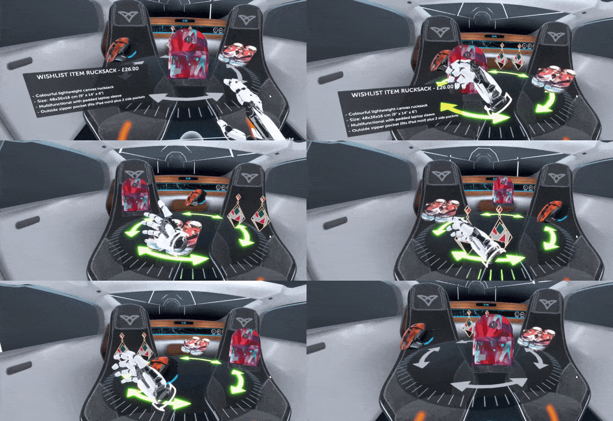
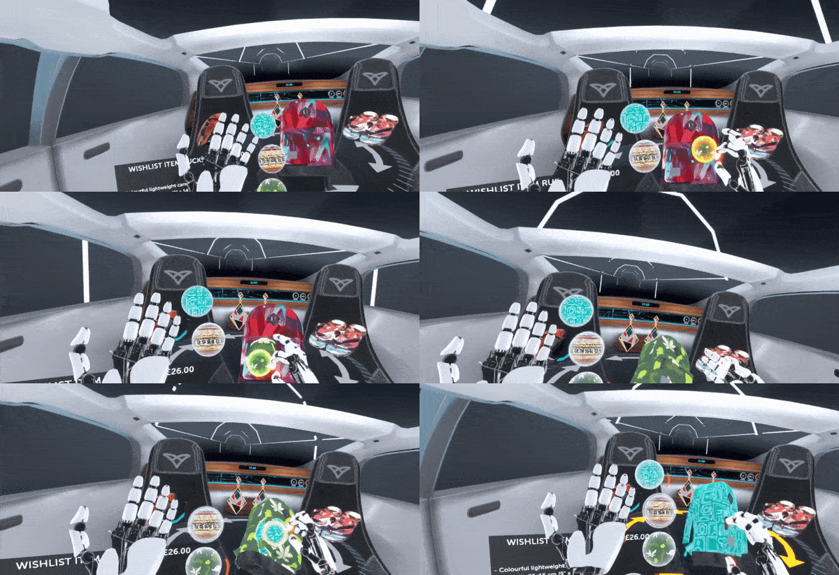
Each item can be picked up and moved around to let the user look at its features, snapping back to the carousel when released. The hand menu then offers customization options: colours and patterns that can be dragged onto the product to change its appearance.
At every step, virtual tactile sensations give the items a sense of physical presence.
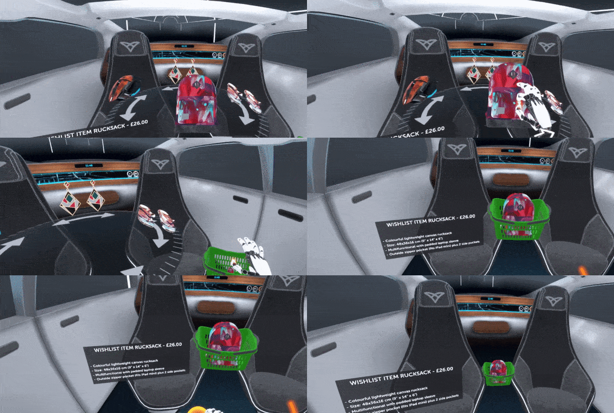
In standard online shopping, you usually click a button to add a product to a metaphorical shopping basket. In our VR experience, you pick up and drop your product into a 3D basket. We chose this since it’s unlikely a user would accidentally drag-and-drop an item into a basket. It also proved to be one of the most satisfying interactions of the entire VR experience.
Once this happens, the other products disappear, the basket takes centre stage, and the user is prompted to complete their transaction using a confirmation slider.
Mindfulness Mode
In the United States alone, drivers collectively spend 70 billion hours behind the wheel each year. When self-driving cars free up that time, we don’t believe it should all be dedicated to productivity and passive media consumption. Our VR experience also includes a mindfulness mode, pointing towards a future where digital experiences while on the move can create time to relax and reflect.
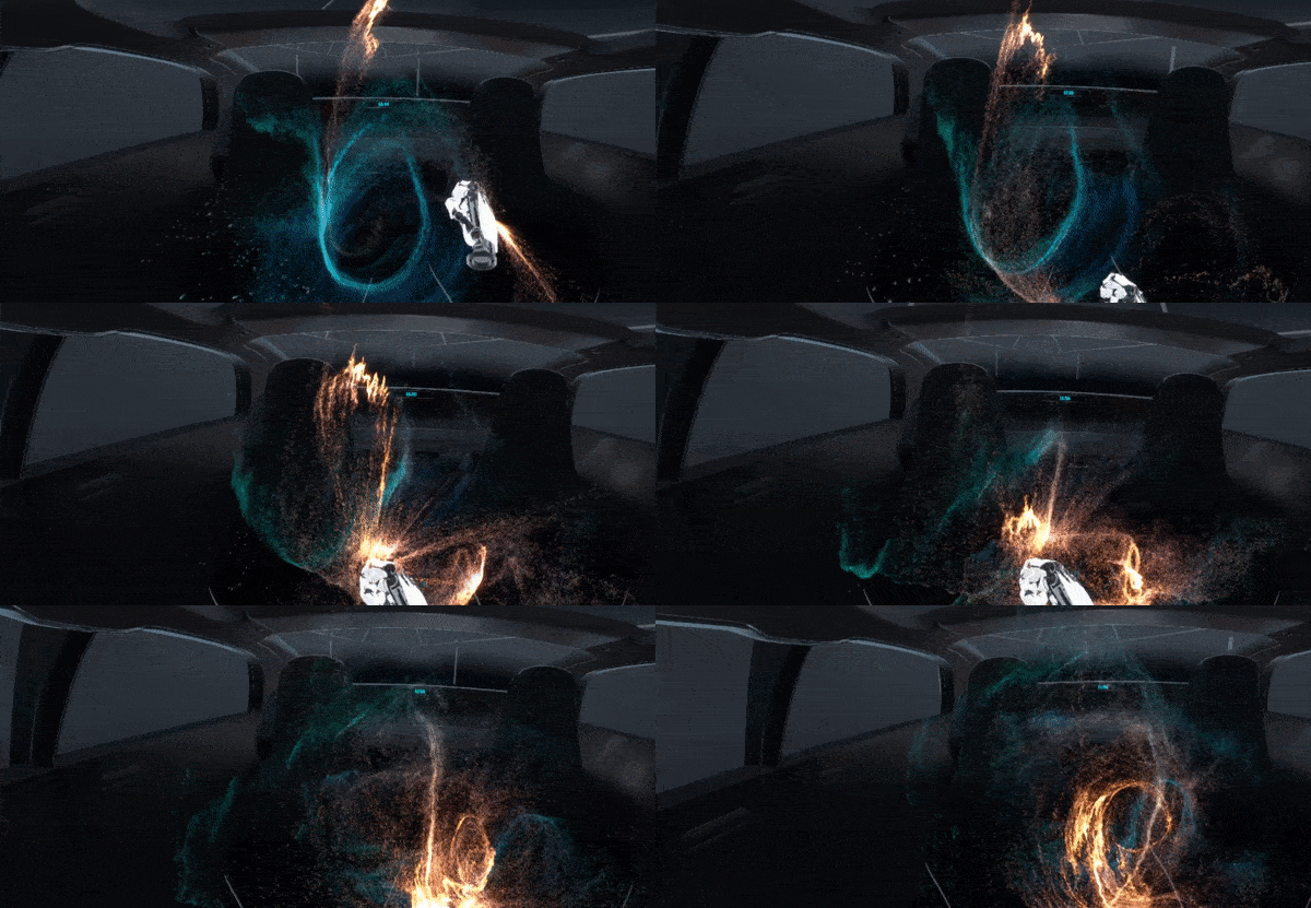
We started by fading the user into a dark space with peaceful ambient music. Once the lighting has dimmed, then a field of particles spiral in a gentle vortex motion. The user can manipulate the particles, which change colour and are attracted to their hands. They also feel the particle clouds flickering over their hands. The section ends by gently bringing the lights back up and the particles fade away.
Future Direction
Optimizing a demo for a three-minute experience imposes its own design restrictions. Just as mobile phones offer a wider variety of touchscreen gestures beyond the human tap, we expect that a more robust interface designed for daily use would involve a more diverse interaction set.
Our team is exploring how we can integrate more diverse and higher-level hand-tracking capabilities into the demo. These may take the form of being able to grab windows as well as pinch them, as well as a wider variety of UI elements.
We’re also exploring where the experience can be streamlined and expanded to allow for extended use. These explorations are a key part of our larger effort to drive the development of new contactless interfaces for the vehicles of the future.
The role of passenger UI in autonomous cars [Whitepaper]
Differentiating brands and monetizing the passenger economy in autonomous and mobility-as-a-service vehicles.